The Objective & Business Context
Analyze and audit existing healthcare platforms to uncover core usability gaps, evaluate user workflows, and establish actionable UX strategies for building a more effective, analytics-driven product experience.
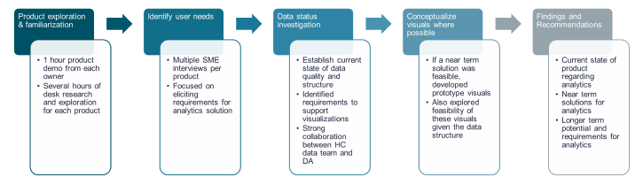
Figure: Workflow
User Pain Points Discovered
- Instructors had to manage multiple tasks during live simulations, making real-time observation difficult. Rely heavily on manual note taking to capture many aspects of performance during the scenario
- Exported data logs required significant time and technical skills to transform into usable feedback formats.
- No current mechanism exists for managing user roles, permissions, or multi-tenant access—identifying a critical operational gap currently prioritized by the product team.
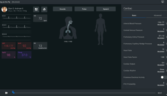
Figure: Current View
Surfacing Results
Based on our discovery findings, we established a strategic roadmap to overhaul the instructor experience. Because instructors serve as the primary drivers of learner outcome tracking and intervention, we prioritized their workflows to maximize platform impact.
- System Capacity: Audited existing product features and underlying data structures to determine readiness for visual analytics.
- Mapped Instructor Needs: Pinpointed high-value learner performance metrics required to improve instructional decision-making.
- Conceptualized Data Visualizations: Designed initial visualization concepts and defined key development priorities across products to support future data integration.
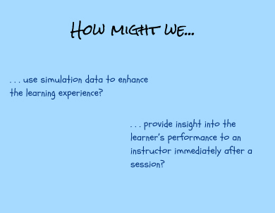
Figure: How Might We
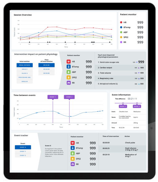
Session Overview Timeline
- Integrated Time-Series Overlay: Mapped discrete learner actions (e.g., medication delivery, checklist milestones, fluid administration) directly on top of continuous physiological patient data over time—giving instructors immediate insight into clinical decision-making.
- Descriptive Visual Analytics: Focused primary visual hierarchy on descriptive analytics (what happened), complemented by targeted contextual indicators to help instructors infer clinical rationale (why it happened).
- Question being answered: What happened during the simulation scenario? (as captured by simulation data)
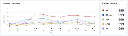
Figure: Session Overview
Intervention Impact on Patient Physiology
- Insights: Enable instructors to visually trace the direct impact of student interventions on patient physiology, bridging the gap between clinical actions and physiological outcomes.
- Question being answered: How do I show to my students what impact their actions had on the patient? (specifically, the patient physiology)
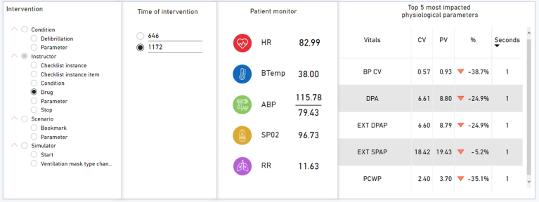
Figure: Intervention Impact on Patient Physiology
Time between Events
- Elapsed Time Tracking: Simplify time-delta tracking by allowing instructors to effortlessly measure the exact time elapsed between key clinical interventions and physiological responses.
- Question being answered: How much time has elapsed between two events during the scenario? (can be event related or just clicked on by the instructor)
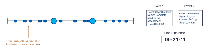
Figure: Time between Events
Learner Response to Degradation in Patient State Tracker
- Adverse Event Response Tracking: Tracked post-event learner interventions by mapping all corrective actions immediately following a negative patient state change, complete with precise elapsed time markers for each response.
- Question being answered: What did my student/learner do in response to a patient’s state becoming unstable?
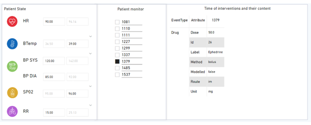
Figure: Learner Response to Degradation in Patient State Tracker
Prototype Development
Driven by initial Subject Matter Expert (SME) interview findings, we moved rapidly from concept to validation. We developed several targeted visualization prototypes, which were evaluated with internal SMEs to confirm strategic value and refine usability details. In parallel, we collaborated closely with the development team to evaluate and validate underlying data structures. To prove feasibility and bridge the gap between design and implementation, we built a functional Power BI proof-of-concept—demonstrating that our proposed analytics could be realized as internal data quality efforts matured.
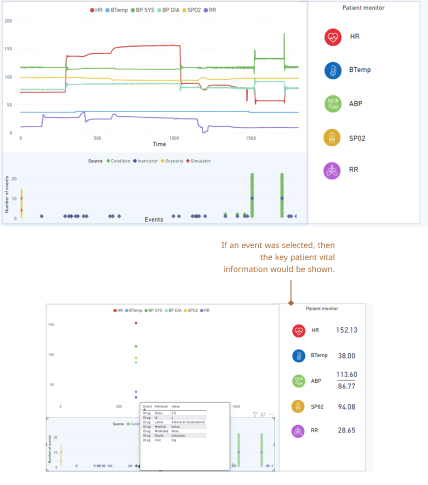
Figure: Session Overview Prototype
Final Solution
The finalized dashboard seamlessly unifies complex clinical data and custom visualizations into a single interface—empowering instructors to evaluate student decision-making faster and deliver targeted, high-impact debrief feedback.
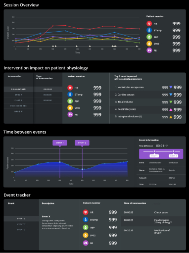
Figure: Dashboard Design